Everything look a little new here? That’d be because I’ve decided to take some inspiration from Monday and use it to build a better space for myself.
After choosing what I knew most about – my cats – and trying to make them something that everyone is interested in, I realized something. Well, a few things.
- I hate cats. Not actual cats. But cat things. Paintings, trinkets, the likes. Reading about them or writing about them.
- I’m not really interested in sharing my cats.
- If I were, it wouldn’t be as easy as I’d like my blog to be – explaining a cat is as impossible as explaining the personality of your mother. (And we really don’t want to go there, do we?)
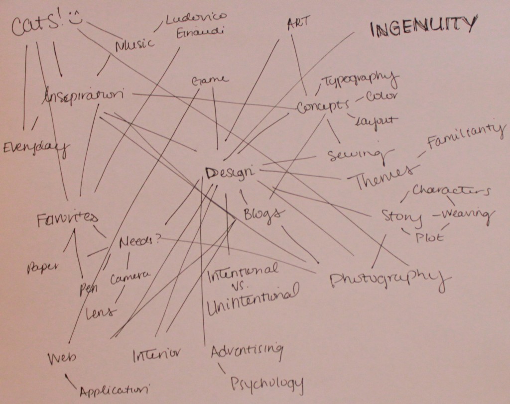
So, I started with ‘design’ and re-worked my association web. I found a lot of similarities and decided I’d prefer to do something as broad as this. I would like to share interesting articles, everyday inspiration, personal projects, global ideas, sporadic lists, and occasionally my own photos. Not to mention I already own the perfect domain, which I was reserving for my portfolio. (Fret not, I’ve set up my blog to be easily relocated so my home page can be used, in the future, as a portfolio linking to said blog.)
And, to kick it off, I’m going to put up poorly composed photos of my webs!
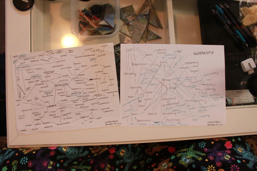
Before anything else, I sat down in a clear area and made this new web. My favorite part was how anything could interlink with so much else.
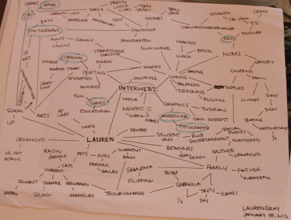
Next I took my original web and circled words that had been used on my new web in a bright color.
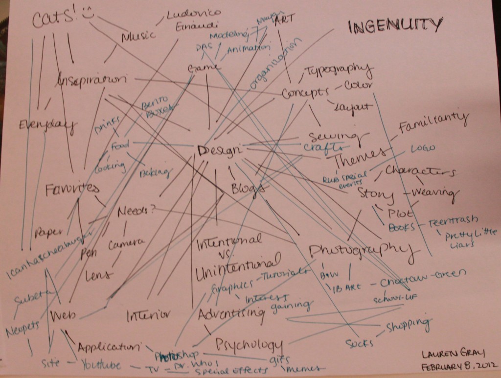
Looking at these circled words, I began to move outward and add concepts I’d mentioned before into my new web. It was wonderful how well these seemed to fit into this new idea! Just looking at them in a different light, and finding so many new ways to connect everything.
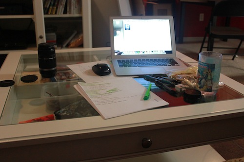
Here’s a side-by-side comparison of the two, and our first look into my workspace. The cat blanket at the bottom of the photo is actually where I’m sitting. You’ll notice I have a glass coffee table where anything that doesn’t have a permanent home goes. Most visible are the remnants of my sculpture course projects. To the right are my pens of choice – all Pilot G-2, and most fine-tip. You’ll be hard pressed to find me using a different pen, or recycled paper. I like my paper to be perfectly straight (that is, crease or even dent free) and, more recently, white (hold the lines).
I believe sharing these kinds of things will be a little more intuitive. More interesting, less difficult, and even more fun to design. (Because, let’s be honest, it’d be pretty difficult to create a classy site about cats – content or design-wise.) But don’t worry, I’m absolutely positive my cats will provide me with plenty of inspiration and reflection. There will still be plenty of cat photos to suffer through! ;)
2 Responses